
Introduction
One of the main challenges of interdisciplinary projects is to establish a relationship between the participating disciplines that actually benefits and opens new avenues of research for everyone involved. As anyone who has worked between disciplines will tell you, there is no one answer, no simple solution that will fit any new combination of disciplines or object of study.
Often forgotten (or at the very least, rarely mentioned) is one of the locales where this relationship is most fragile: that is, with the dissemination of the final outputs of a project. Most publication outlets will be either strictly disciplinary (say, an article in a scientific journal) or take a form widely accepted by only one set of connected disciplines (e.g. a monograph or a performance in the arts and humanities). Even when the content of the publication is entirely collaborative, the fact that it is published in, say, a science or an arts and/or humanities outlet usually implies that one discipline leads more than the others.
From the start we wanted to avoid this and create an outlet that would be as disciplinary neutral as possible. We do recognise that disciplinary outputs are valid and significant, of course, not only for career progression but for the disciplines themselves; but we wanted our major and main publication to be entirely on our terms. This is why we created the digital bee book*, and this is why we built it from the ground up. In this article, we explore the principles that led us to designing and building the bee book as you see it today.
Principles and Inspiration
We understood from the start that if we were to create our own discipline-agnostic publication, then its form and function would have to go hand-in-hand. In other words, we wanted the digital bee book to look good but to also be functional; we wanted some of the most arresting visual aspects of our book (such as the design of the hive on the landing page) not only to be functional but also meaningful, that is, we wanted it to say something about how we understand the relationship between the different parts of our project.
We also wanted to avoid the impression that any one discipline was more important than any other, and we wanted our design to express that equality clearly. Ultimately, during our initial conversations, we kept returning to two sources of inspiration: the object from which our project started, Butler's Feminine Monarchie, and the bees themselves.
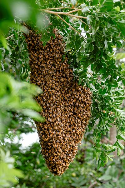
The Feminine Monarchie in many ways is the incarnation of the Renaissance book — interdisciplinary, historically informed, and scientifically progressive — something that we would like our project and, by extension, our digital book to be. The bees, the little invertebrate animals and their society that both Butler and we have studied, offered a model: multiple individuals with differing responsibilities and specialisations working towards a common goal. The more we thought about these two models, the more we began to understand our digital bee book as a hive, housing the fruits of our different specialisations.
The Hive
The idea of the hive, which provided a metaphor for the way in which we worked together as well as a visual conceit to encapsulate that interdisciplinarity, is not as obvious as it appears. It is not hard to see that it might be apt for a digital bee book in which we imagined ourselves depositing the fruit of our labours (much like the foraging bees returning with nectar from their travels). Where the metaphor begins to fail, however, is as an illustration of the relationship between the four main sections of our digital bee book.
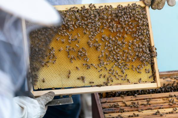
The way in which we came to reconcile our understanding of our interdisciplinary work, and, by extension, our digital bee book, as a hive, was to think of each of our main disciplines as offering a different point of view on the same object. Here, again, thinking about the physical hive was helpful. Naturally occurring hives normally have only one small entrance so the bees can leave to forage and return to the colony. Human-made hives, however, have multiple access points from which beekeepers can inspect the bees and honey production. In other words, human-made hives offer multiple points of view on the same object. Our disciplinary division, likewise, can offer different points of access to our project: each of the four main sections (literature, music, science, and connections) offers a distinct entryway into Bee-ing Human while, simultaneously, the actual content lives happily side-by-side on the landing page.
Iterative design
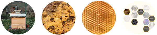
Translating this rather complex metaphor into a usable web page design is, mostly, an exercise in abstraction. The hive — the thing itself — particularly a human made one, is little more than a nondescript box. There is one aspect of that box that we wanted to incorporate into our design: the multiple access points, as discussed above. Mostly, however, a box is not what we imagine when we think of a hive: what we have in mind is the honeycomb, the hexagonal structure that holds the honey. Moving from the thing itself to its echo in the digital bee book is a process of simplification and abstraction, where a stylised honeycomb stands in for the box, and where particular cells are entrances to collections of material.
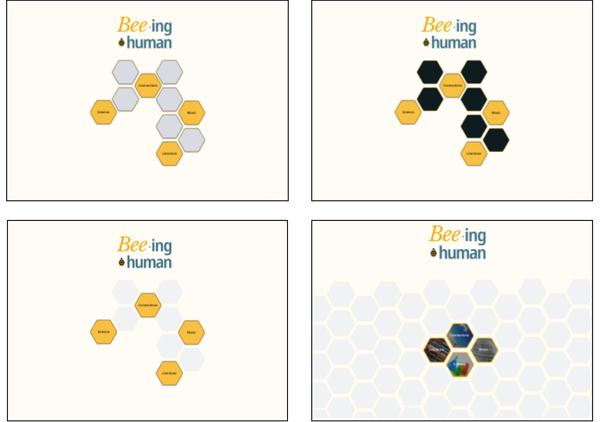
The abstraction of the hive brought with it a number of design elements that became more or less obvious as our collaboration took shape, including:
- the use of cells as the unit of content (both figuratively as on the landing page, and metaphorically as in each of the section pages);
- the hexagon as a visual reminder of the hive, present in both the cells on the landing page and in various flourishes throughout the digital bee book (horizontal rulers in text, the section switcher on the banner of the website);
- the colour scheme, based primarily around shades of honey-yellow, and complemented with further accent colours (see the colours in the logo of the digital bee book, the accents around the section cells on the landing page, or the background of the entire book).
These elements were present from the start and have stayed, broadly, unchanged from our first drafts. But the landing page where our hive is most clearly displayed, went through a number of iterative revisions. Broadly speaking, we started from a simple idea, and then multiplied the hexagons, and the links between them:
At this point we, once again, returned to Charles Butler's Feminine Monarchie in search of inspiration. Like us, Butler used an engraving of a hive in his frontispiece (and Jennifer Richards talks about its significance here), and like good thieves, we borrowed some of those ideas turning our landing page into an almost literal title page. We could have continued to play with this idea, as Butler clearly did, but we chose a minimalist design instead for pragmatic reasons: good web design must be accessible and responsive, and we needed a landing page that could adapt to different size screens and resolutions.
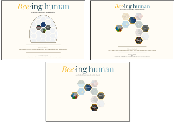
At a certain point, while playing with the idea of cells as entryways into different sections of the hive, we realised that it would also be a good idea to make use of the other cells on the landing page as small doorways into specific content of the digital book. They are, figuratively, smaller but they still provide direct entrances into the work of the project, and that's why you can peek at a little section of its content but can't quite make out what it says: for that you need to click through to enter the cell itself. The content of the cells is chosen at random from the entire content of the website, as you can see every time you reload the landing page. This aspect performs two functions: on the one hand, it places all content (from all disciplines) on the same level; on the other, it invites a certain randomness in navigating the website, hopefully even encouraging readers who are more interested in the music aspects, for example, to explore the different disciplinary outputs of the project.
We also wanted to enable readers to randomly jump between disciplines and content throughout the website. This is why we have a permanent section switcher button on the header of the page that allows you to immediately move from the literature section to the science section without having to return to the landing page. At the planning stages, we even considered having multiple versions of the same content that could be displayed from wherever you had landed: for example, if you were reading an article on the literary history of Butler's text but had arrived through the music section, the article would be a more musically-inflected version of the same content available through the literature section. Time and resources have made that idea impractical. A similar feature that we developed (and is implemented), but which is not yet available, is a type of expanded link that would allow us to link to multiple specific places of content at the same time; we called these portals and they are another extension of our idea of cells as entryways. Here is an example of this, using different conceptions of
Conclusion
We set out to design something that reflected our understanding of how our different disciplinary outlooks relate to each other, and how we worked together to build knowledge. Simultaneously, we had to maintain enough familiarity so that readers could easily navigate the digital bee book without needing a significant how-to use manual (although one is available). This is a tall order for any design but we hope we have achieved our aims.
At first sight, one might be tempted to dismiss the hexagonal cells on the landing page as an opportunist nod to bees. In fact, as we hope to have explained here, demonstrated through their use, the design is the result of a fairly complex, collective thought process about how to communicate a significant amount of information, including about how to work together.
Plus, we really like how it looks.